

Why Poster Design Still Catches the Eye
Have you ever wondered how brands manage to catch the eyes of thousands of people? Their posters and banners are the reason. In today's highly saturated world, filled with advertisements, they remain a powerful marketing tool. Attractive banners always catch the attention of people.
They're used for promoting events, marketing products, and conveying information. Posters are important for businesses that wish to stand out from the crowd.
To reach out to wider audiences with your banners, you need to create a very attractive design. It is not easy to catch the eyes of people. This can get a bit tricky, which is why we have made this guide to help you.
How to Create Eye-Catching Posters
Here's how you can upgrade your poster design game. Follow these steps to make an impressive banner.
➔ Have A Clear Message
Before you begin, ask yourself what you wish to achieve with the banner. Do you want to inform people about an upcoming event? Or do you want to create awareness about a new product before launch? Answering these questions will help you set a clear direction for the process.
Use clear language to communicate through the advertisement. Don't confuse the viewers with complex language. The message should be obvious enough for people to understand.
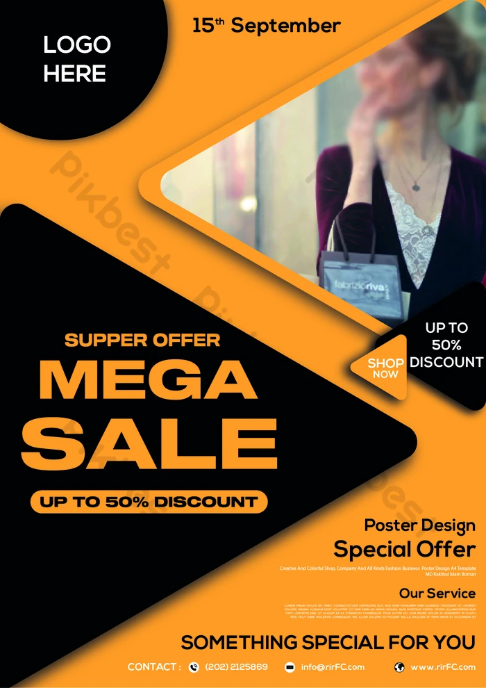
➔ Choose a Color Scheme
One of the most important aspects of impressive poster designs is their colors. They play a vital role in shaping people's perception of your brand. They're effective at evoking certain emotions. Well-chosen colors influence how your audience reacts to your advertisement. They also encourage action.
➢ Color is a major driver of customer decisions, influencing 62–90% of purchase decisions, which makes it a crucial element.
Here's a guide to help you:
|
Colors |
Associated Emotions |
|
Red |
Energetic and attractive |
|
Blue |
Professional and elegant |
|
Yellow |
Playful and optimistic |
|
Purple |
Luxury and imaginative |
|
Green |
Natural and fresh |
➔ Pick A Suitable Font
Your design won't be complete without a good font displaying your main message. This is the most important part of the process. Your banner won't work if it's not clearly conveying its main message. A well-chosen font that aligns with your branding will also boost memorability.
➢ Research has shown that posters can improve business recognition by 2.3 times.
Readability is a major factor when choosing fonts. Pick one that is easy to read. If you're using more than one font, choose those that complement each other. Create a careful balance to get a cohesive look. For example, if you want to have serious time, serif fonts are a good option. On the other hand, script fonts are great for stylish banners.
➔ Create a Layout
One thing many tend to overlook when designing posters is the overall layout. It is how your poster components come together to form one whole image. Here are some key factors to consider.
● Balance:
Distribute the visual elements equally throughout the available space. For order and stability, go for a symmetrical layout. If you want energy and dynamism, opt for an asymmetrical appearance.
● Free space:
The white space of your banner is as important as the visual elements. These empty areas are needed so that the overall look doesn't overwhelm viewers. They will allow people to focus on the visuals without getting distracted.
● Alignment:
Your alignment choice should create a professional impression. Maintain a consistent placement to make it easily readable.

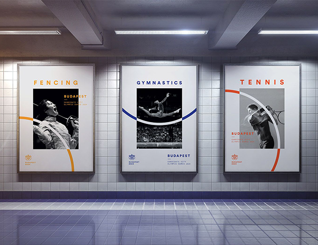
➔ Add Images and Graphics
Pictures and graphics are essential for posters. They are powerful tools in conveying complicated information quickly. Your choices should complement the overall message of your banner.
Use relevant visuals that directly relate to the information you're trying to convey. Make sure they are of high quality so that the advertisement looks professional. Crisp, clear graphics will elevate the overall appeal.
➔ Ensure Consistency
The elements you use should align with the overall aesthetic you're trying to achieve. Visuals that don't complement each other only create a cluttered look. This overwhelms the viewers.
If you're using bold fonts, the images should have a similar style. Don't try to use completely different elements. It might disturb the overall balance of the appearance.
➔ Don't Forget Branding
Your poster is the face of your company. This means that all your choices should align with the overall visual identity. The use of a consistent logo, color schemes, and messages is essential. All these components must come together to further strengthen your image. This will improve your business's memorability.
➢ In a 2025 study, 68% of consumers reported purchasing after seeing a billboard, especially with a digital call-to-action.
Pay close attention to the logo placement. Work with a logo design company to create an attractive symbol for your brand. Put it in a spot where it is easily seen. Stick to the color scheme of your visual identity to create recognition. Don't forget to add a clear call to action. You need to tell the viewers exactly what you want them to do.
➔ Maintain a Visual Hierarchy
The difference between banners that impress and those that don't is the presence of a hierarchy. This is the arrangement and presentation of elements, including their size and placement.
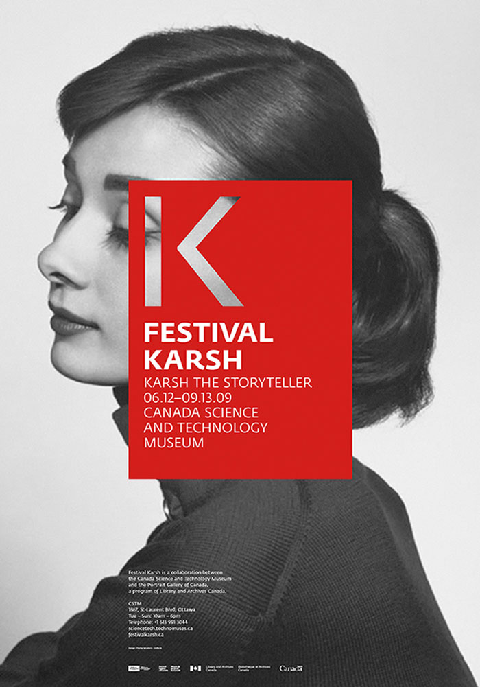
The most important things should be the most visible. Viewers should be able to follow a direction in the design. Prioritize what should stand out from the rest and what is of less significance. This will create an impressive balance.
People Also Ask
● How do I make my banner stand out?
Try different color contrasts, shapes, and font sizes to make the poster appealing. Make sure all the parts form a coherent image.
● What are some mistakes I should avoid?
Don't overload the space with too much text, images, and visual elements. This will only overwhelm the viewers. Keep your brand's color scheme and fonts in mind for an impressive design.
● What is the rule of thirds in design?
This is a technique that involves dividing the area into a 3x3 grid to create nine equal boxes. Place important graphics on these lines to achieve a balanced layout.
● Can I use textures in my design?
Yes, they add depth and visual appeal to a plain-looking appearance. Subtle, grainy textures offer an old feel. Fonts with textures make headlines attractive and unique. This contributes to the complexity and visual appeal.
Conclusion
Posters are about more than just catching eyes. You need to get people to take an interest in what you're trying to communicate. The design should combine artistic elements strategically to clearly convey your message.
Carefully arrange the elements to create a visually appealing layout. Your choices should complement the overall appearance. Do not overcrowd the available space. Pay close attention to the alignment, color, and typography to leave a lasting impact on your audience. Lastly, don't be afraid to experiment. Sometimes, unusual paths lead to amazing destinations.